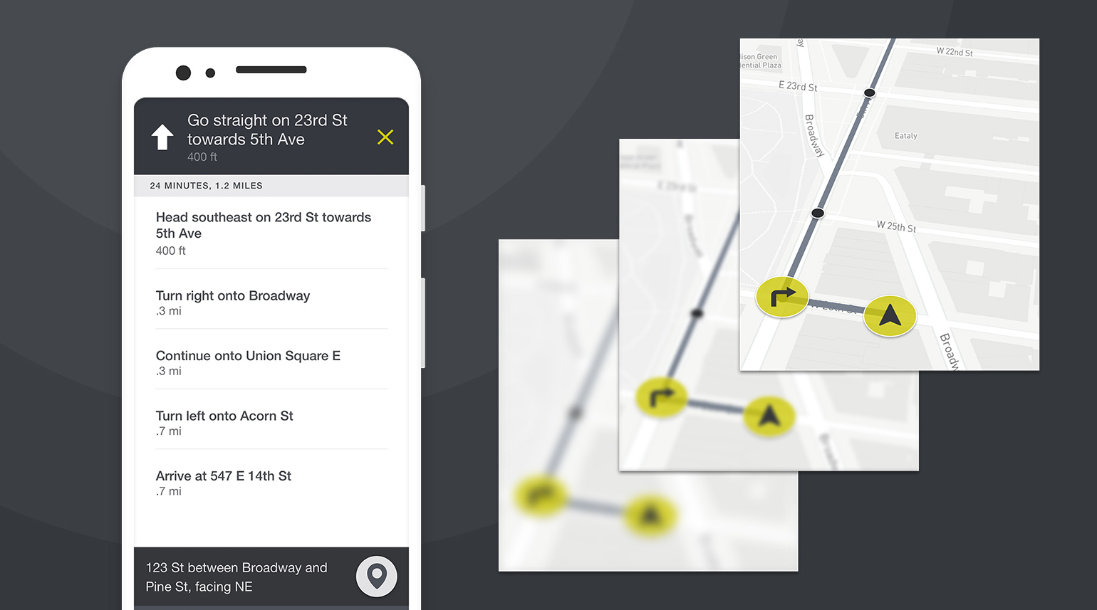
Designing a touch-based companion app for the visually impaired
WearWorks, a leader in haptic design, partnered with us to develop a companion app for their innovative Wayband, a wearable that helps the visually impaired navigate independently through touch. Tasked with creating an intuitive, accessible app, we immersed ourselves in the experience of navigating without sight. Through empathy, expert consultations, and testing for accessibility, we built an app that empowers users to explore the world hands-free.
Outcomes
Accessible Experience for All
We designed an app for users with varying vision levels, ensuring accessibility for blind to low-vision users. By simplifying interactions and implementing key accessibility features, we ensured everyone could navigate the app effortlessly.
Intuitive Touch-Based Navigation
The Wayband app guides users through tactile cues, turning complex navigation into a smooth, understandable experience. We leveraged haptic feedback to make navigating the world simpler and more intuitive, even without sight.
Positive User Impact
The app and Wayband wearable empowered users to achieve greater independence. It received widespread recognition from the tech and design communities. Its success in enhancing the lives of visually impaired individuals speaks to the power of thoughtful, user-centric design.
Designing for Every Vision Need
WearWorks tasked us with creating a companion app for their Wayband wearable, designed to empower the visually impaired. Our approach started with empathy — understanding the entire vision spectrum, from completely blind to low-vision to those with normal sight. Through field research and firsthand experiences navigating without sight, we crafted an app that supports users across all levels of vision, ensuring it’s accessible, intuitive, and empowering for everyone.


Touch as a Language
Keith Kirkland, cofounder of WearWorks, explains the science behind haptic communication and how touch-based cues can guide and inform users. We learned how haptics can offer nuanced, meaningful feedback to the visually impaired through TED talks and discussions. By diving deep into the psychology of touch and sensory feedback, we were able to design an app that would seamlessly communicate through vibrations, making the experience of navigation effortless and intuitive.
Accessibility-First Design
When designing the app, we focused on accessibility at every stage. With a wide range of user needs, we prioritized high-contrast visuals, legible text, and voice prompts, ensuring every interaction was optimized for voice input and screen readers. By carefully analyzing the habits and pain points of users with varying vision levels, we created a simple, highly usable interface that makes navigating the app easy and intuitive for everyone.


Simplicity Meets Functionality
The Wayband app design had to be as simple as it was functional. We adopted a minimalist approach to support a diverse range of visual impairments, including color blindness and low vision. The goal was to ensure that no matter the user’s level of sight, they could easily engage with the app, benefiting from a design that was easy to see and use. A sleek, clutter-free interface meant the app could deliver crucial navigational information without overwhelming the user.


A Resounding Success
The Wayband app has not only empowered the visually impaired across the U.S., but also earned accolades from the design and tech communities. Featured in major outlets like Forbes and Fast Company, and even showcased in the Cooper Hewitt museum, the success of the app and its impact on users’ independence speaks volumes. It’s a prime example of how empathy and design can transform lives and elevate user experience to new heights.


The Wayband: Gentle Guidance Through Touch
The Wayband wearable guides users through touch. Pairing with a phone via GPS, the Wayband uses a "virtual fence" to steer the user in the right direction. Gentle vibrations serve as intuitive cues—each buzz pattern signals a different action, like turning left or right. Wayband’s approach isn’t about reinventing navigation; it’s about simplifying it, making navigation through the world easier for those who need it most.
In The News

Urban-X’s investors showcase features high-tech face masks, navigation for the blind and more
Perhaps the potentially life-changing of the products and services demoed at the Urban-X showcase is by WearWorks. Their prototype wristband is a proposed solution to GPS-based navigation for the blind and visually impaired. Using haptic feedback, the WayBand uses a powerful motor to give you tactile sensations about where you are and what direction to walk in.


A haptic wristband could help the blind 'see' the world
Technology to help the blind navigate usually focuses on replacing the sight they're missing or by adding auditory cues to an already cluttered soundscape. But for many sight-impaired individuals, the sense they rely on most is one that tends to be ignored by a lot of tech-based solutions: touch.


Beyond the finish line
For 35-year-old runner Simon Wheatcroft, however, this stretch of unused roadway may as well be his gym, training center, and proving grounds, his own private version of the 72 stone steps that make up a Rocky montage. Wheatcroft knows every inch of this one-third-mile strip of asphalt — from the contours of the roadway to the feeling of its double yellow lines of paint under his sneakers. Despite the mind-numbing bore of jogging such a short length in endless loops, Wheatcroft had to memorize it. He’s blind.

Creating Accessible Experiences for All Users
Building an accessible app isn’t just about checking boxes — it’s about understanding the diverse needs of your users. In our work with WearWorks, we designed an app that supports the full spectrum of vision impairments, from blind to low vision. Accessibility is at the core of great product design, and we know how to make your app work for everyone, no matter their abilities. Ready to design for inclusivity?


